Wisevis – Advanced Excel Dashboards
$97 Original price was: $97.$33Current price is: $33.
Shopping Instructions:
- DISCOUNT 15% : SHOP15
- Product Delivery: Within 1 – 12 hours after purchase.
Download available within 12-24 hours. Excel Dashboard PopulationVBA? No way! Wait. If you want a more powerful Excel dashboard there are two things that you can’t avoid: pivot tables and recorded macros. In this tutorial you’ll learn how to make advanced pivot tables.
Wisevis – Advanced Excel Dashboards
How to make advanced dashboards in Excel
Home → How to make advanced dashboards in Excel
(click to enlarge)
Better dashboards, better decisions
Your organization needs dashabords to monitor its business. It’s you, the user, who should design them, not the IT dept. And how do you start? Get the data and make a fully functional dashboard that really answers business needs… in Excel. Will management be impressed? You bet! And you can actually implement the dashboard or use it as a proof-of-concept. Here are a few good reasons why you should make a dashboard in Excel:
- Get a better, more global understanding of your business;
- Improve your Excel and data analysis skills;
- Get a promotion
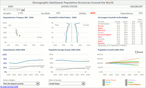
My two step-by-step video tutorials will show you how to make an advanced dashboard in Excel like the one on the left. Then you just have to use the same techniques to create your own awesome dashboards. Get instant access now!
(Two dashboard courses only $97.00. Lifetime access, 30-day, no questions asked, full money-back guarantee. Pay securely with your Paypal account.)
This is the most amazing tool for learning advanced Excel I have come across and is also a shining example of Excel best practices.T., a user of the Excel Dashboard Tutorial
Excel Dashboard Lookup
Confuse (and delight) your managers with an Excel dashboard that doesn’t look like an Excel dashboard. This course shows you how to use advanced Excel functions to aggregate data and make an interactive dashboard. And you can even display your data in a basic map! Click here to know more…
Excel Dashboard VBA
VBA? No way! Wait. If you want a more powerful Excel dashboard there are two things that you can’t avoid: pivot tables and recorded macros. In this tutorial you’ll learn how to make advanced pivot tables. If you haven’t used them yet you’ll be amazed of how powerful they are. Then you’ll need a few recorded macros to synchronize them. Record your actions and assign the macro to a button. It’s simple, really. Click here to know more…
Get immediately download Wisevis – Advanced Excel Dashboards
Better Data Visualization
These dashboards are free from 3D pie charts, speedometers and other stupid and useless effects. If you want to know why they are bad for business please read the blog, you’ll find many reasons. A good chart can dramatically improve the way you use and make sense of your data. Always apply the best practices and visualization principles when designing your dashboards.
Latest Posts
- The drummer – a data visualization bedtime story
(…) On the top of the mountain was a plain. There stood an…
- The best of two worlds: the scatterplot pie
The best chart is always task-dependent, but let me assume that you would…
- The drummer – a data visualization bedtime story
(…) On the top of the mountain was a plain. There stood an…
Recent Comments
- Jorge Camoes on 05 Creating a Population Pyramid [LKP]
- Jacqueline Siebert on 05 Creating a Population Pyramid [LKP]
- Jacqueline Siebert on 05 The Evolution of Age Groups [VBA]
- Jorge Camoes on 05 The Evolution of Age Groups [VBA]
- Jorge Camoes on 05 Creating a Population Pyramid [LKP]
Be the first to review “Wisevis – Advanced Excel Dashboards” Cancel reply
Related products
Other Courses
Other Courses
Other Courses
Other Courses
Other Courses


Reviews
There are no reviews yet.